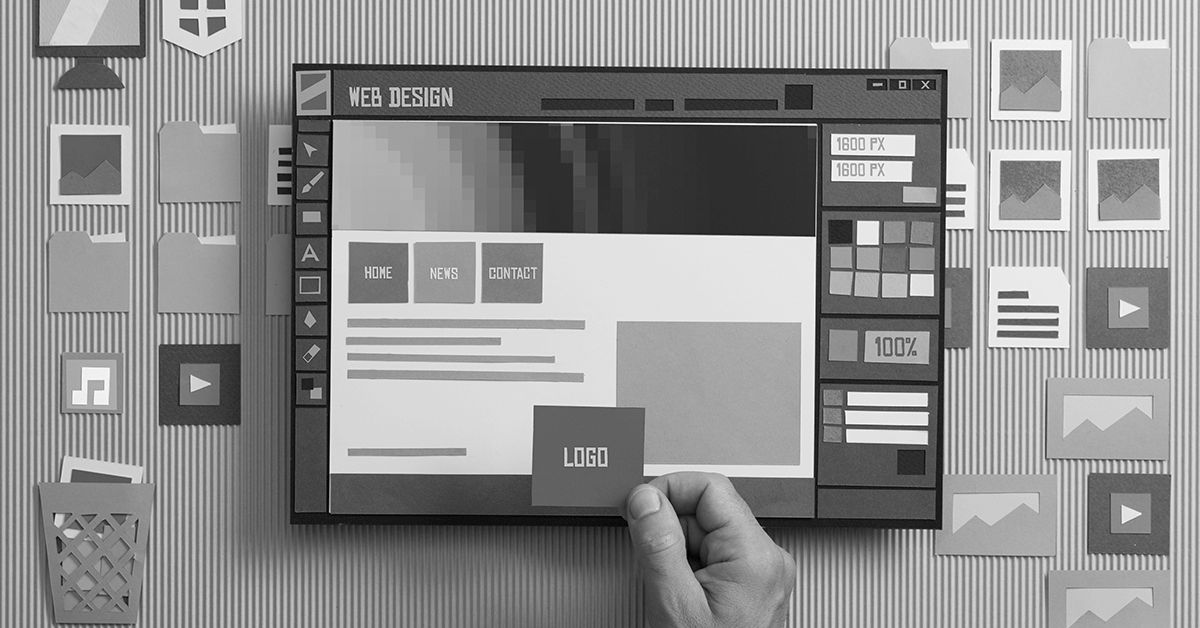
When a visitor lands on your website, there are so many things that they immediately take into account. Analytics confirm that you have less than a second to convert a visitor into a customer. Everything right from your design, font, color choices, content to usability will influence a person’s decision to stay on your page.
Web design plays an influential role in customer conversion rate and when some of these mistakes are made, they could inversely affect your brand’s reach and growth. This is what should be avoided when designing or revamping your website.
– Dezvolta Team
1. Old School Web Layouts Don’t Work
Being ready to adopt change is important and customers get instantly turned off when they see a website that looks so nostalgic. Not in a good way because any design element or template could be considered retro in a matter of months or years in this fast-changing world. If you haven’t redesigned your existing website in the past 3-5 years, you are missing out on a large portion of your potential customers and it’s time to approach a reputed website design company.
2. Inconsistent, Random Design Elements Thrown In
A seamless visual express is a key to attracting your visitors and converting them. The website’s layout, if it begins with bright, light colors and bold fonts, it should continue all over. Switching to a black and white tone or simply introducing too many images instead of content scream inconsistency. It forces users to feel alienated and abandon the page. Avoid it by keeping your web design consistent throughout the pages and offer a smooth wave-like experience for your visitors.
3. Never Use Too Many Fonts on the Same Page
Another common mistake that is sometimes triggered by sheer creativity is using too many fonts on the same page. Just imagine an amateurishly designed web page where you have used fonts like Georgia, Futura, and Helvetica to make an announcement, any average human will find it very difficult to understand the flow and the message inside it. A good design aesthetic is to go with a major font for the website combined with a secondary font. They should be web-friendly, look professional and set the tone for your business.
4. Infusing Many Colors at Once
A strict no! Much similar to how using multiple fonts in a single page would affect the user’s capability to read and understand the content, too many shades of colors would make any new user find it tough to cope up with the layout. You can choose a color that is slightly similar to the shades used in your logo or go with completely contrasting colors than your logo to differentiate them on the website. Pick colors that pair with one another and maintain them throughout the website.
5. Inconsistent Spacing
Follow the guidelines of design principle proximity when creating boxes, icons and placing headers. The content area and images should merge with one another with the right amount of spacing. If they are too tight, they look cramped and your customer conversion rate will get affected as they may choose to close the website. Similarly, large spaces could create emptiness on the website’s layout making it harder to follow what’s your primary objective is.
These are some of many mistakes which when committed in website design could hurt your customer conversion rate. By fixing them all and working with a professional web design company like Dezvolta, you can get the best services possible while giving your business the boost it needs with attractive web design solutions.