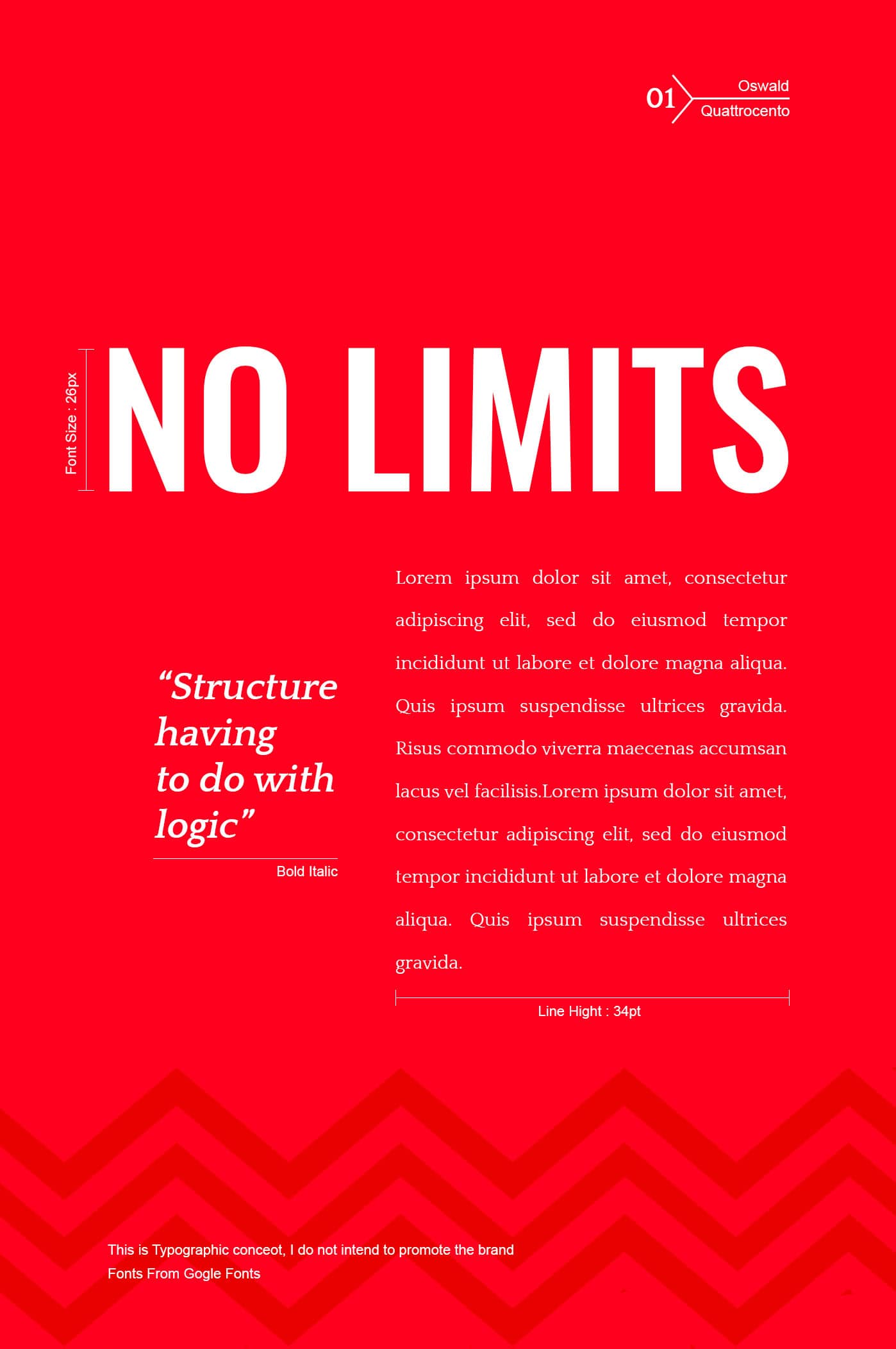
1. Oswald / Quattrocento
Oswald represents a genre of fonts that is simple by design yet elegant and classy in style. It is sharp, bold and intelligent and can make a grand impact in the minds of the readers. Quattrcento, on the other hand, is mild and a tad sober in outlook but displays details. This contrasting pair of fonts work well together and can relay the intended messages.
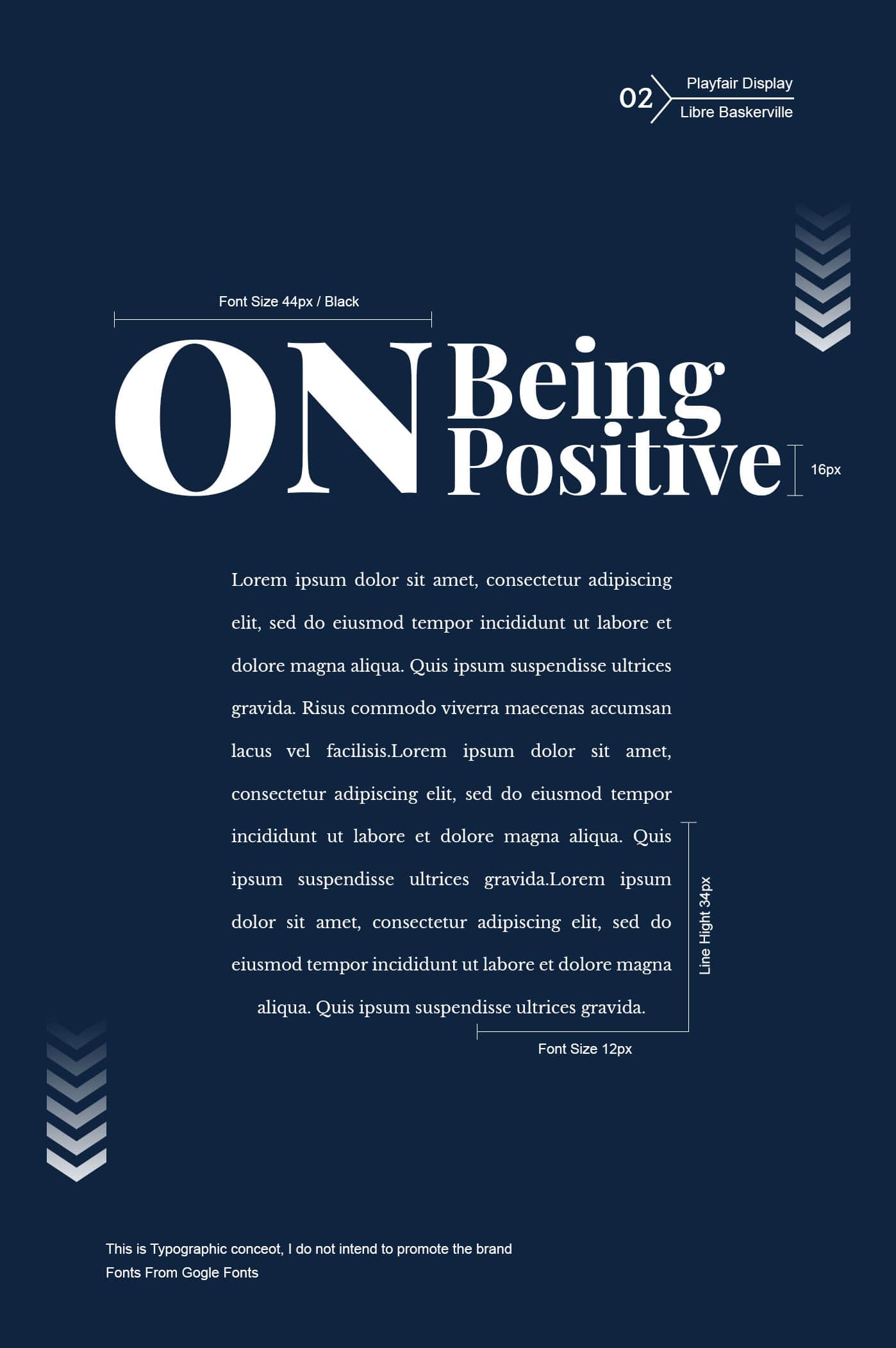
2. Playfair Display / Libre Baskerville
The characteristic contrasting delicate hairlines intermingled with bold streaks makes Playfair Display a font that stands out. The slight elongation makes Libre Baskerville a perfectly readable font when employed for body texts. The marriage between the two seemingly different font types is indeed a twisty love story that is truly astounding.
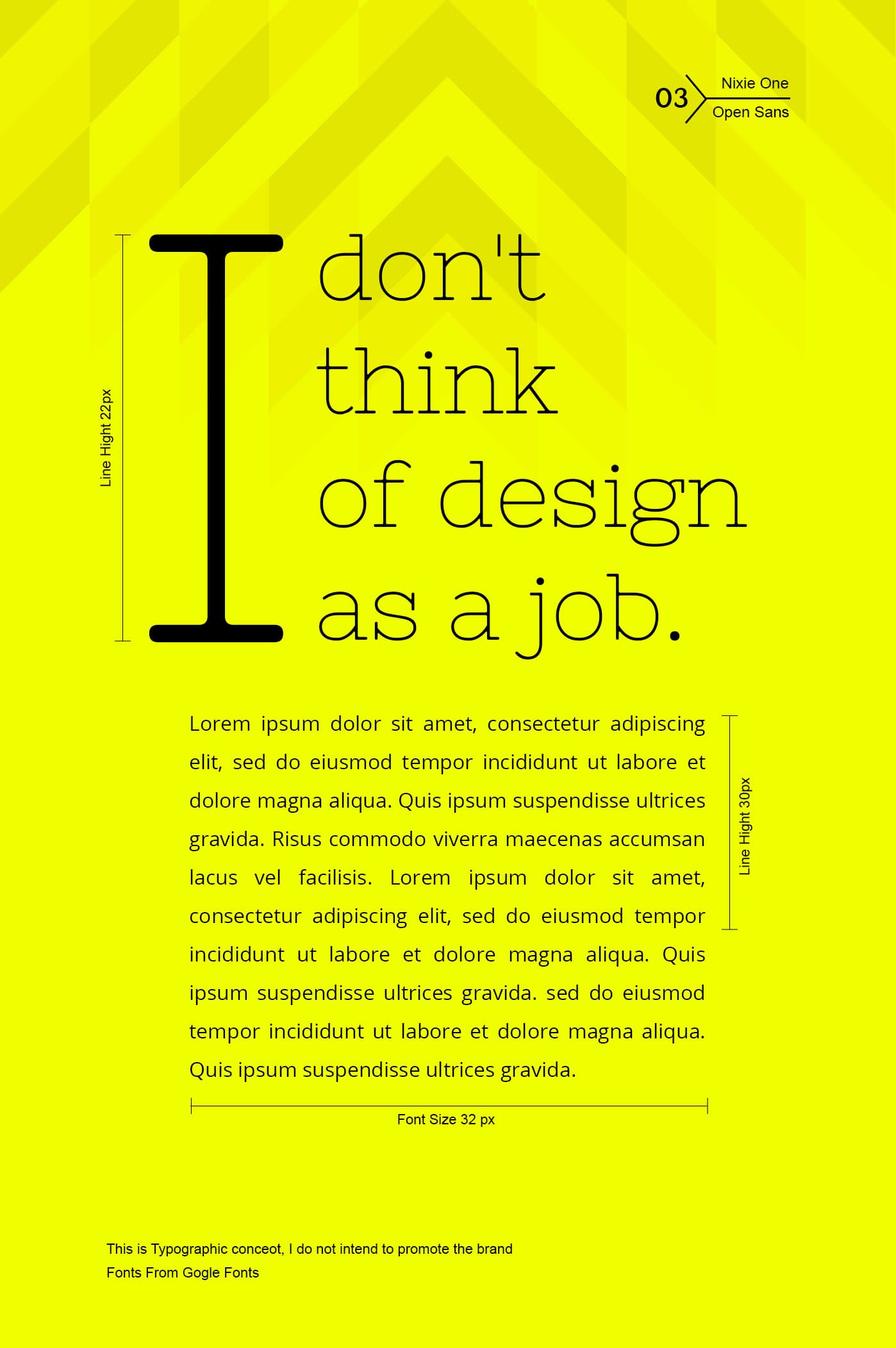
3. Nixie One / Open Sans
If you want something short and sweet occupying the headlines, you should give it to Nixie One. This font touted as a mixture between neon tubes and a typewriter brings us the memory of signage filled streets of Las Vegas and the good old typewriter. The not-so-contrasting sleek and simple Open Sans quite surprisingly goes well with Nixie One to pass as one of the neat font combos.
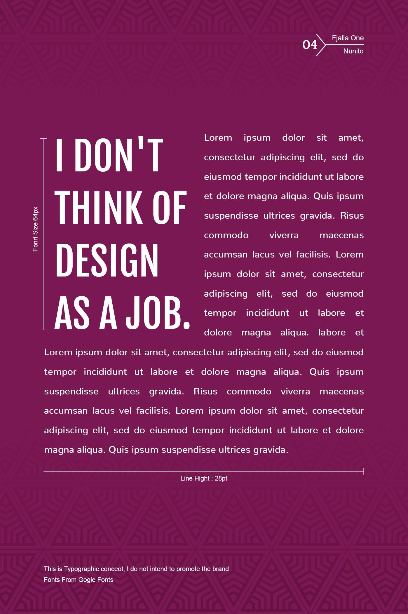
4. Fjalla One / Nunito
The wide range of sizes in which Fjalla One can be used shows the flexibility it displays. Contrast it with the flexibility of Nunito, a sans serif typeface font with its 14 different subtypes of varying weight. If simplicity is your mantra and you are looking to do up something simple yet eye-catching, this combo should work for you.
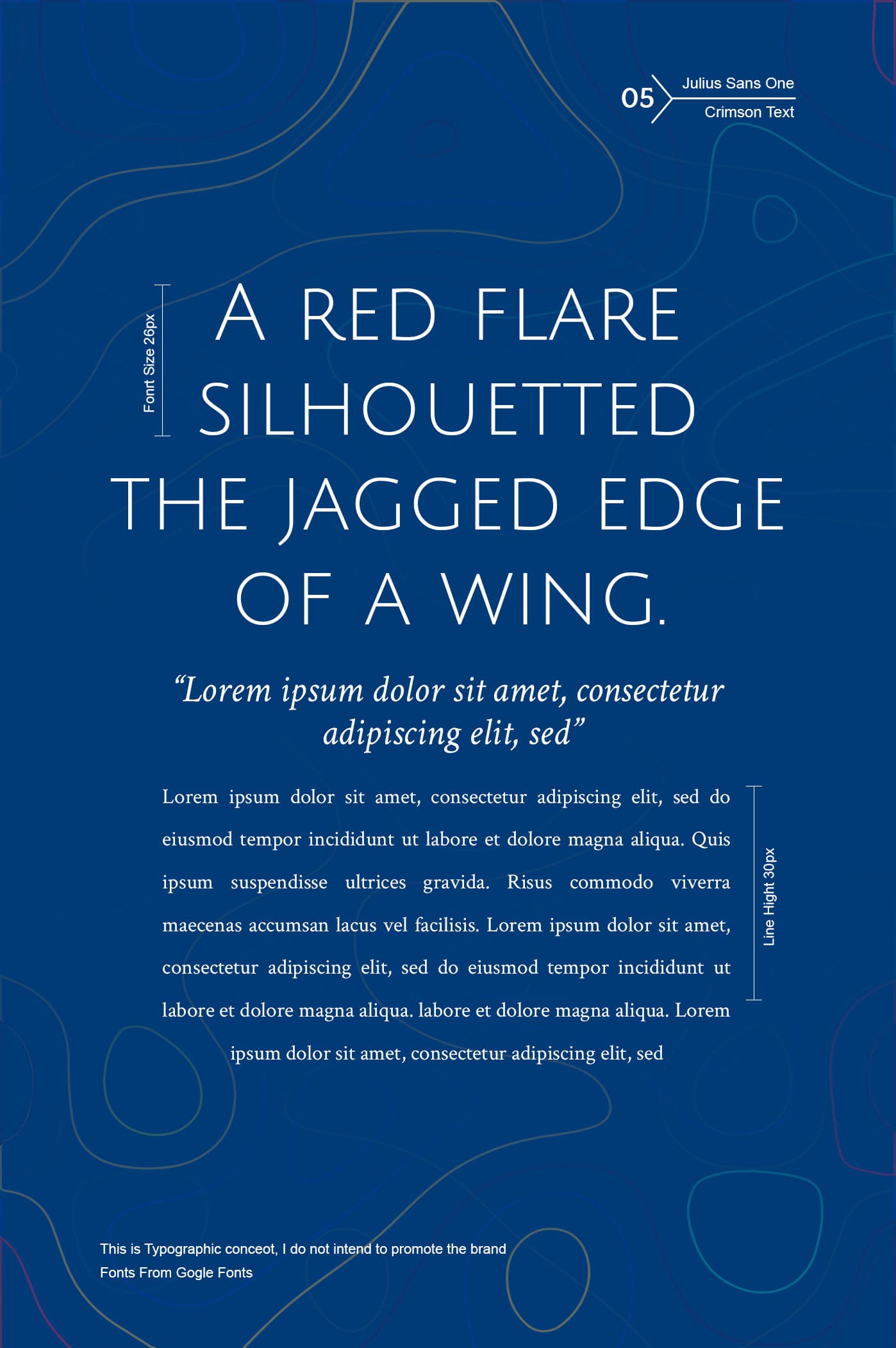
5. Julius Sans One / Crimson Text
A combination of looking chic and opulent at the same time characterizes Julius Sans One, a font belonging to the sans serif typeface font family. The uncomplicated Crimson Text resembles someone’s neat handwriting. The thin elegance of Julius Sans One find a match with plain Crimson Text and makes a silent pitch in the process.
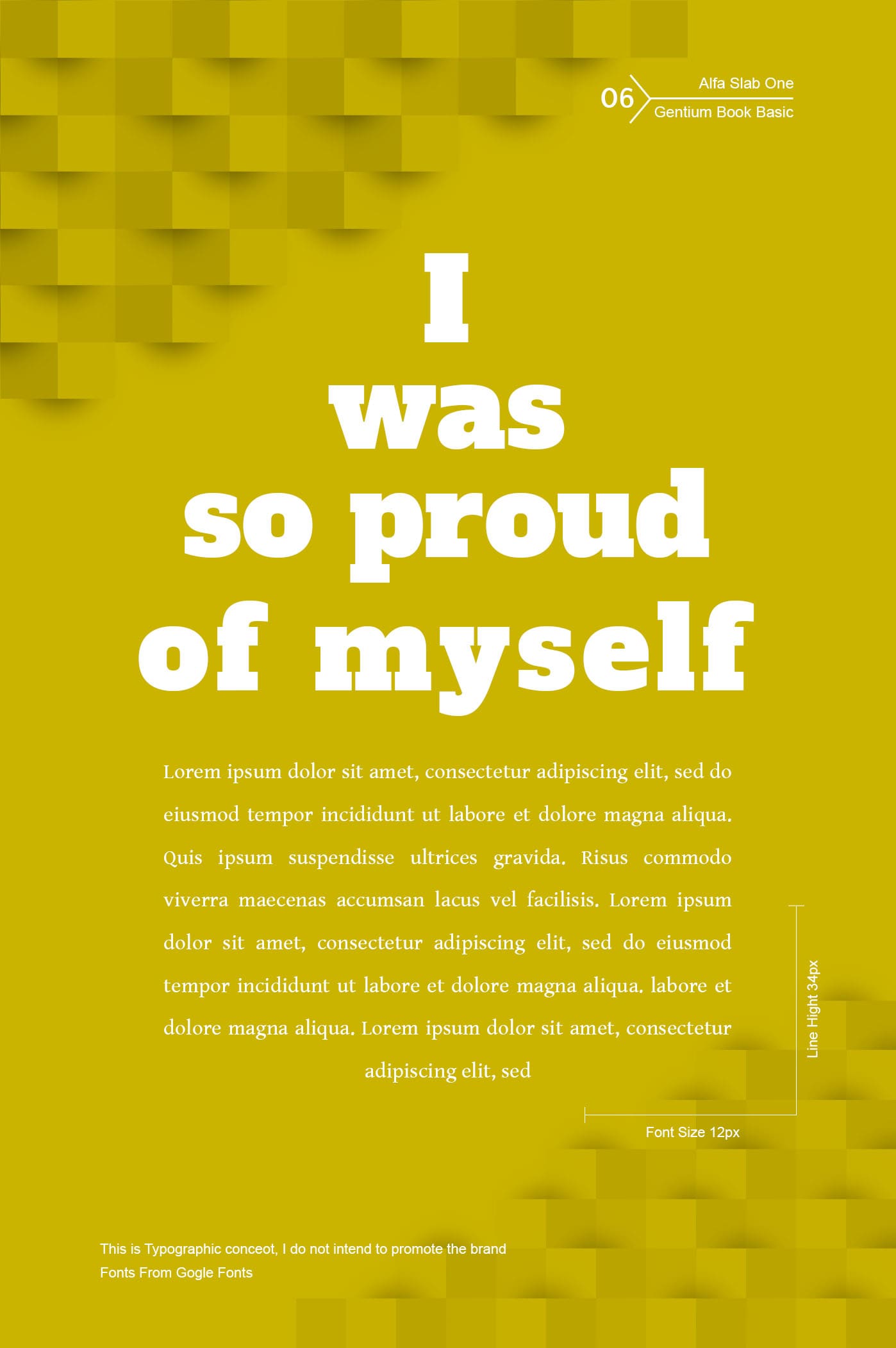
6. Alfa Slab One / Gentium Book Basic
Look out of the window and check who the boss is. Say welcome to Alfa Slab One, a new definition to boldness. If you are looking for a font that resembles a sitting duck but is clear and readable, Gentium Book Basic is the one you should be rightly looking for. The bold statement made by the combination of the two fonts is sure to create a lasting impression in the reader’s mind.
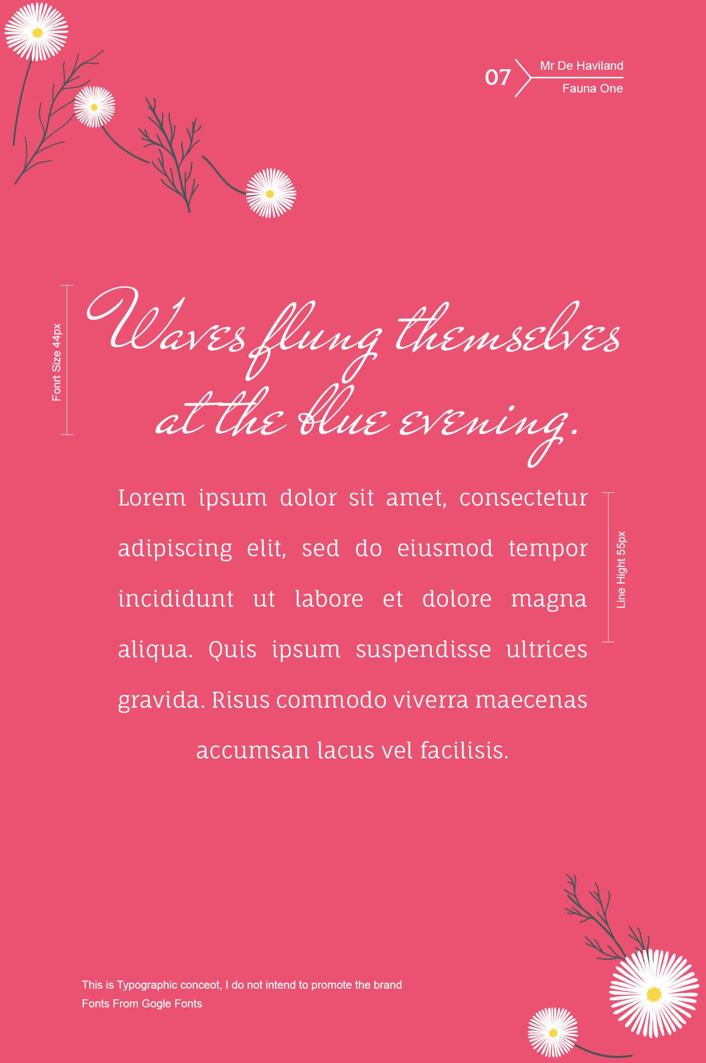
7. Mr De Haviland / Fauna One
If you are looking for an elegant feminine touch to your caption, Mr De Haviland’s script type font should be your choice. The modern typeface of Fauna One with its softer and curved corner looks straight forward and as easy as pie. Should your text carry natural background imageries, these contrasting pair of fonts are sure to do well.
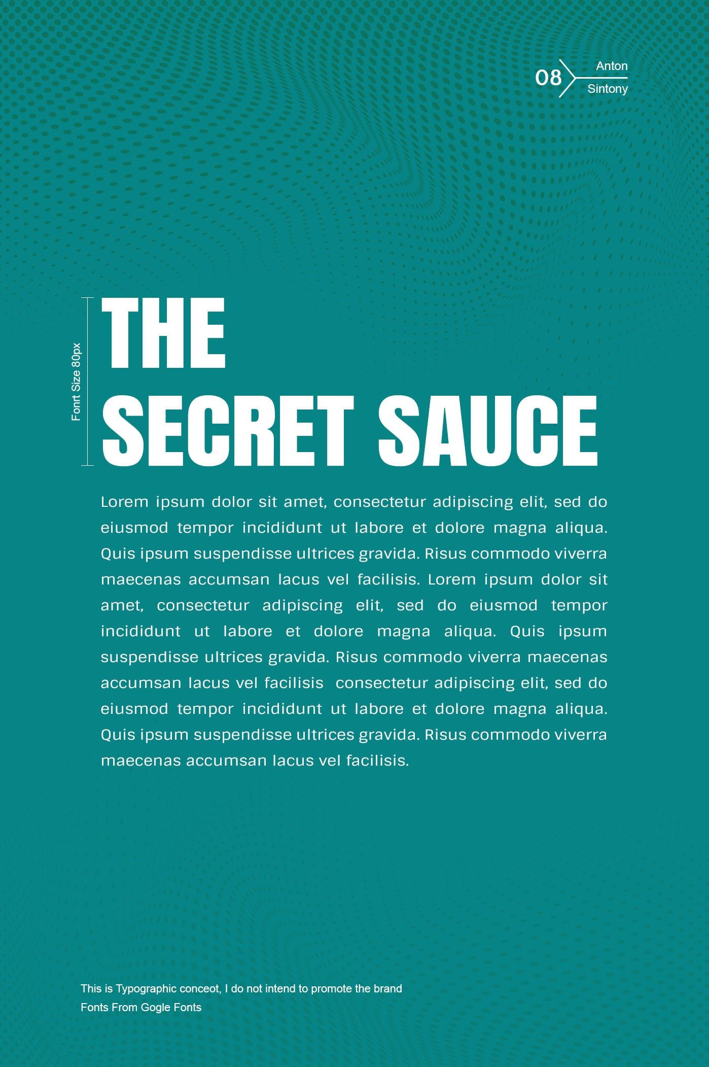
8. Anton / Sintony
Modern web browsers have a love for sans serif typefaces and among them Anton occupies the royal spot. The slightly square-shaped Sintony with its smoother strokes is pleasant to the reader’s eyes. A content box with a header text in Antony and the subtexts in Sintony rhymes well not only in sound but also to produce sound visual effects.
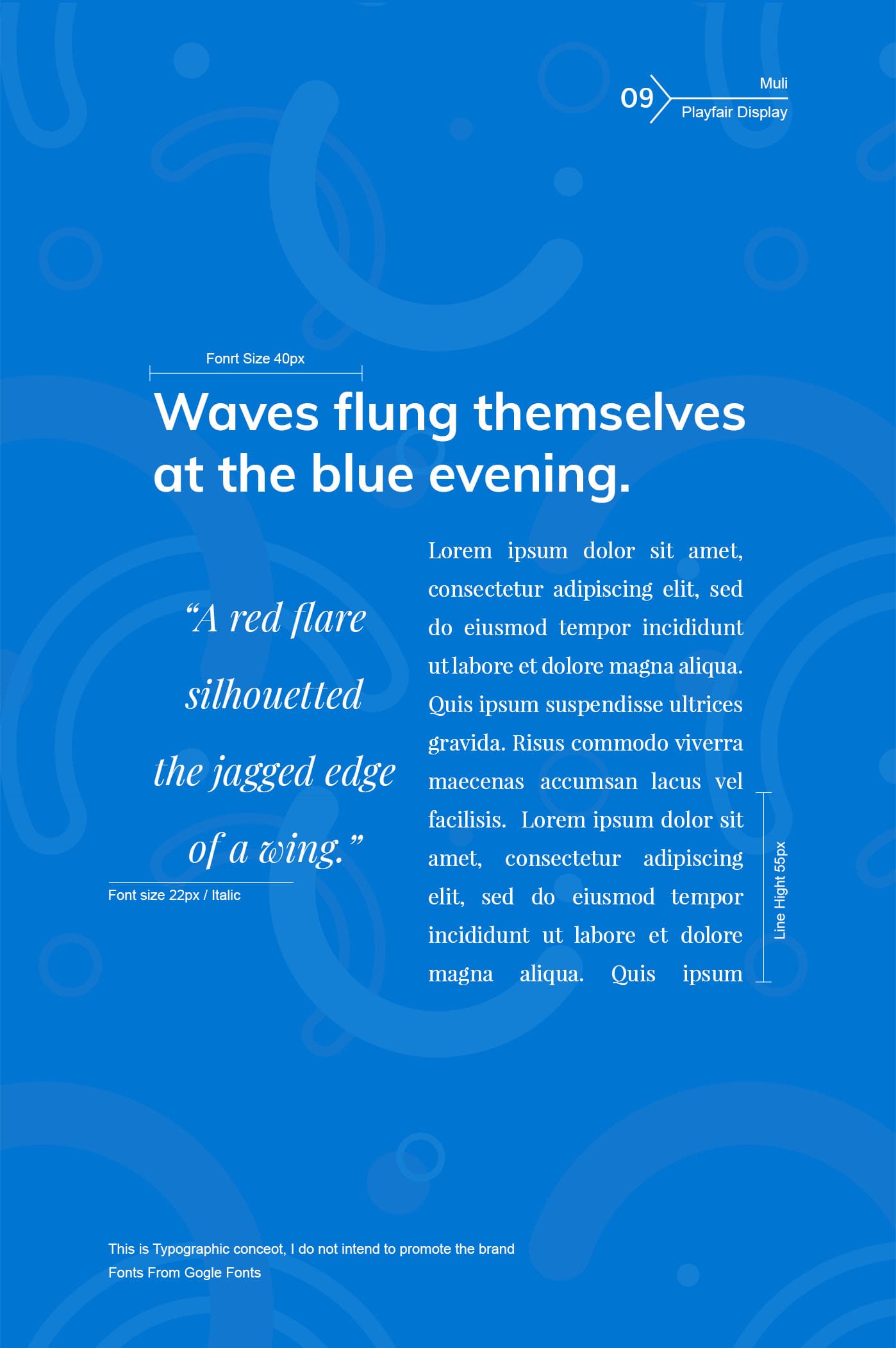
9. Muli / Playfair Display
Muli is a two-in-one font which can be used as a display font and a text font too. The delicate hairlines intermingled with bold streaks of the Playfair Display rather brings in a degree of affability. The agreeability of Muli combines with the transitional character of Playfair Display to create friendly typography.